Strategy May 16, 2019
How to Embroider on Stripes and Patterns
With proper planning, there’s no need to shy away from decorating on bold prints.
Embroidering designs on striped or patterned fabrics can be your worst nightmare – or your new BFF. There’s always a chance a customer will request work done on an item with a busy background, so you can’t avoid it forever. But it’s also likely the unique results you end up with will inspire you to try new and different combinations. And though there are some considerations you’ll need to plan for, as long as your approach is well thought out in pre-production, your results can be awe-inspiring or over-the-top cute.
Scale and Size: While some prints are big and bold, others are small and all-over, resulting in what feels like a solid. You see this in fashion when patterns are combined and held together by similar colors. One item will be bold and overpowering, while a pattern in the same color family is smaller in scale that (in covering the fabric) gives the sense of a solid that does not compete with the bolder pattern. This can work in combining stripes with a pattern as well.
Sometimes a pattern will seem to dictate the subject of embroidery, or its placement. This happens when the pattern consists of an all-over print or lettering. Think of a fabric covered with nicely arranged horseshoes, embroidered with a horsehead or a horse and rider. Or an all-over floral that plays host to embroidered bumble bees or butterflies. A bold pattern may provide blank space ideally situated for an embroidery design. Think of a tree limb pattern, and add an embroidered bird in the blank area. Or a bold buffalo check print with large squares that would nicely frame embroidered designs.

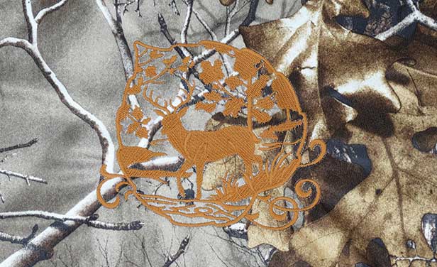
This example shows a background that was a little too busy for the thread color chosen. The matte-finish thread blends in with the camouflage print background. (Maybe that was the goal.) Photo courtesy of Embroidery Library.

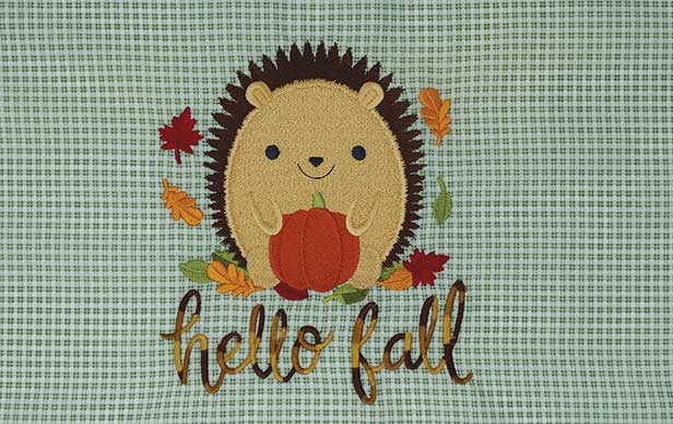
This hedgehog design uses a high stitch count on a lightweight plaid fabric. A different choice of stabilizer could have helped keep lines straight and avoid distortion. The background is small and all-over and nearly works as a solid, so it may pass inspection for some. However, puckering and wavy lines need to be avoided. Photo courtesy of Embroidery Library.
Color Competition: Since embroidery is often the focal point of a garment, cap or soft good, thread colors will need to be bold enough to stand up on their own. You may choose colors that contrast with elements in a pattern so the embroidery is the central focus. For a more subtle, high-end look, as in a monogram or personalization, you may go for a tone-on-tone color selection. Even a matte-finish embroidery thread (rather than shiny) that blends in with the fabric is an option. Finally, if bold colors are in the fabric print, pick some up and repeat them in the embroidery design. Don’t be afraid to switch out colors in a stock design in order to include some that complement colors in the pattern of the fabric.
Thread Weighs In: Beyond color, thread weight is also an option you’ll face. Stick with 40-weight thread for most fabrics. If the design you’re doing includes small details, or the printed fabric is delicate, you may opt for 60-weight thread. You also have a decision of luster versus matte, in case one works better with the fabric to be embroidered.
If there’s any glitter in the fabric, you may want to enhance your design with the addition of a 40- or 50-weight metallic thread, which should work fine in a stock design. If your patterned background depicts nature or acts as a backdrop for floral embroidery, you may even want to choose an ombré embroidery thread, which will change color, from dark to light, giving a natural, random feel to your design.
Avoiding Distortion: When a design is meant to line up with stripes on a garment or fabric, the design needs to be straight, like lining up a design or logo with a left chest pocket. If the alignment is off, the design or the pocket will look off-kilter. This is where proper hooping comes in. The design or logo needs to be parallel to the stripes on the garment. Try not to stretch striped fabric when hooping or you can end up with distortion. Rely on the proper use of backing to hold the design in place and in alignment with the stripes of the fabric while stitching.

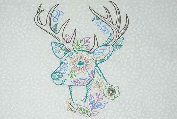
This tone-on-tone all-over print becomes a “textured” solid and a good choice for the fancy deer design. The scale of the print is in good proportion to the design element of the deer. Design courtesy Embroidery Library.
Unlike a solid-color background where puckering is a flaw but not overpowering and can often be minimized with steaming, a print or pattern will “scream” puckering if a straight line becomes wavy due to embroidery stitches pulling the fabric. Lighten stitch density if necessary to assure the design is not overpowering on a lightweight patterned fabric. HoopMaster makes a pocket alignment guide many commercial embroiderers use. It provides a precise alignment grid for pockets and striped shirts to ensure designs will come out straight.
Proper hooping tension, use of a stabilizer and a design that isn’t overpowering in stitch count will create an attractive look that’s aligned properly with a striped or patterned background.
Alice Wolf is the manager of education and publications at Madeira USA. Contact her at awolf@madeirausa.com; (800) 225-3001, ext. 107.
