Strategy August 20, 2019
How to Build a Better Trade Show Booth
Trade shows give companies the opportunity to connect with and entertain their customers. They’re “the music festival of brands,” says Mark Seymour, chief sales officer at Next Level Apparel (asi/73867). But when you’re just one booth out of a thousand – or more – what can you do to strike a lasting chord with jaded attendees?
Competitive Edge, a North Carolina trade show consulting firm, was on hand at the 2019 ASI Show Chicago to evaluate a random selection of 100 exhibitors, judging them on criteria such as creativity, attention-grabbing techniques, effective presentations and more. We spoke to several suppliers recognized by Competitive Edge’s E3 Exhibiting Effectiveness Evaluation team to get some pointers on how to create a compelling and engaging trade show booth. Read on to learn more about the categories the E3 team highlighted and how suppliers excelled at each.
1. Creative Attention-Grabbing Techniques
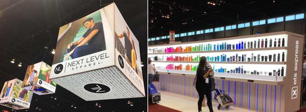
[At left] Next Level Apparel used three backlit cubes to share its brand message. [At right] ETS Express organized its products by color and size on a 40-foot-long backlit wall.
Dramatic lighting, attractive graphics and imagery, and in-booth promotions are all effective methods for standing out from the crowd.
Be warned, however: Convention centers tend to have terrible lighting, which can put your booth at an immediate disadvantage, according to Chloe Ayres, marketing manager at Sock Club Enterprises (asi/88072). Seymour agrees: “You may have designed the perfect setup, but the location of your booth could change that because you can’t change the venue’s lighting.”
Consider incorporating your own lighting to help grab attendees’ attention and make your displays more appealing. ETS Express (asi/51197), for example, employed a backlit wall to showcase its products – eliminating shadows and providing accurate color representation. “We took a big risk on the illuminated background,” says Brandon Bell, vice president of sales at ETS. “It was borderline on, ‘Is that too much?’ but still forced you to come check it out.”
Top-tier signage and high-quality, relatable images are also great head turners. Next Level Apparel hung three hard-to-ignore backlit cubes from the ceiling, communicating its brand identity, what the company does and showing off relevant imagery. “The cubes allow you to present consistent messaging throughout,” Seymour says. “They were different images, but you feel like you’re getting the whole compelling story any direction you look.”
2. Effective Visual Communications
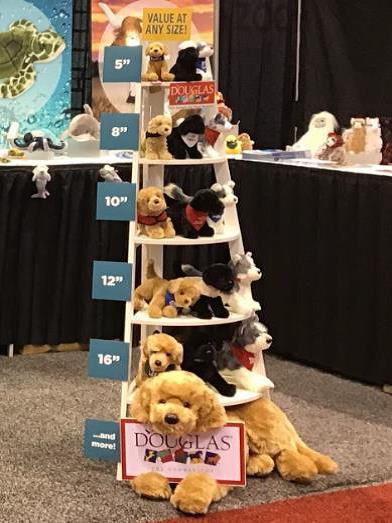
Douglas Co. grouped its plush offerings by price points on each shelf.
Messaging is everything. The purpose of a trade show booth is to explain the who, what and why of a brand. Graphics and flyers can do that, but be sure your message is clear and easy to understand.
Avoid packing in too much information on backdrop displays and graphics. “Don’t just repurpose an email or flyer because people won’t read that,” says Steve Lawrence, business development leader at 3M/Promotional Markets (asi/91240).
Instead, try focusing on a single, important topic, says Elizabeth Jarvela, promotional sales manager at Douglas Co. (asi/50708). “We decided to create one main talking point display to explain all the available options in one location,” Jarvela says of Douglas Co.’s Chicago booth.
Don’t give customers information they’re not interested in. “We have several different flyers separated by categories, so they’re tailored to the customer’s needs,” says Tina Liu, sales and marketing manager for Otto International (asi/75350). Otto also provides promotional selling kits, selling guides and educational tools with product samples to clients.
3. Informative Presentations /Demonstrations
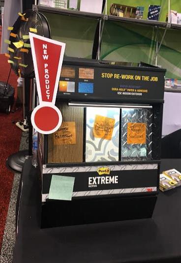
3M Promotional Markets proved the stickiness and waterproof benefits of its products with Post-it demonstrations.
Sure, you can tell attendees how awesome your product is, but seeing is believing. “You can always talk about it, but it’s really compelling to show real-world examples of how it works,” Lawrence says. “You want people to see it with their own eyes for proof.”
Demonstrations attract crowds and generate engagement, but they do require careful planning. Large displays and demonstrations need room, so take booth placement into consideration. “Corner units will give you more space,” Lawrence says. He also suggests creating a demo that can be brought down to a smaller scale, but still delivers the same effective message.
Use audio visual technology and electronics to provide information about your brand to customers not actively engaging with staff. “We use iPads to pull up our website with customers to help them get familiar with our website,” says Robin Crampton, president of IDProductSource (asi/62088).
Just be conscious of what you highlight. “You have to be careful that what you’re demonstrating is going to be the product or service that you’re offering or it will take away from what you’re trying to achieve,” Liu says.
4. Best Practices in Staffing
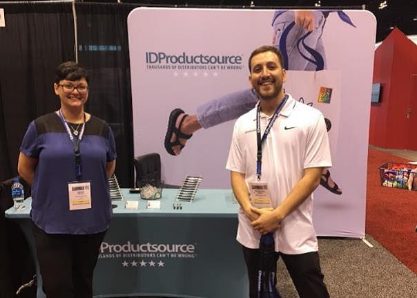
Employees staffing the IDProductSource booth looked and acted the part, smiling and engaging visitors, while holding product samples to create interest and start conversations.
It doesn’t matter how well-designed your booth is, if you don’t have enough (or the right) staff there to meet customers one-on-one and educate them on your brand message. “It all comes down to engagement,” Crampton says.
Your staff should come prepared to talk to every customer that comes to your booth. “We even have a bilingual (Spanish-speaking) team member to help us communicate with a diverse crowd,” says Robert Russell, CEO of Strike Promo (asi/67451).
Be sure to develop a game plan and brief your staff before the show, Crampton says. “We want our people to know why they’re there and what they’re talking about,” she adds.
Staff conduct and presentation are also important. Remember the basics: no eating, sitting or talking on cellphones in the booth. Always have staff present, and be attentive to customers; be friendly and conscious of body language and demeanor. “You have to be on at all times,” Crampton says. “You really show that you care about what you do, like you want to be there, because customers can feel that.”
Dress professionally, but be smart: Invest in a pair of comfortable shoes to help minimize pressure on the feet. Crampton suggests providing staff with snacks, drinks and mints to keep their energy up throughout the day. “Keep in mind trade shows can be exhausting, but remember why you’re there,” she says.
5. Smart Exhibit Access and Attendee Navigation
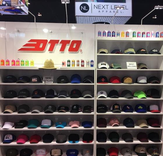
Otto International grouped and labeled its products into natural categories, making it easy for attendees to navigate.
Yes, the goal is to attract a lot of people to your company, but an overcrowded booth could also intimidate potential customers. “You want people focused on the product, not the congestion and crowds,” Russell says. An open and easily accessible booth is essential.
Design your booth layout with comfort in mind. “You want an inviting space that allows you to engage with people,” Lawrence says. Avoid physical barriers such as tables, counters or even chairs that could hinder engagement. “Chairs invite people to sit down when the goal is to keep people moving around the booth and actively checking out your product,” Liu says.
Product placement can help prevent huddling. “Space out products so something interesting is throughout the booth,” Liu says.
Improve staff engagement by splitting up products to highlight new ones in a separate display. “This also motivates people walking by to stop and look around because of the split crowd,” Bell says.
6. Changes Exhibitors Made
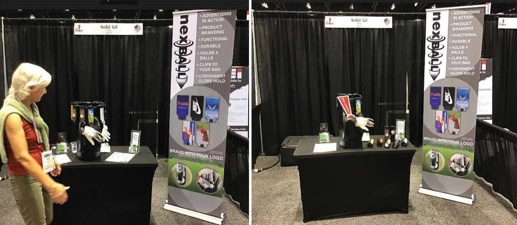
[At left] Before receiving feedback from the E3 team, Nexball Golf’s display was cluttered with too many products and handouts, distracting from its overall message. [At right] After simplifying the display, Nexball’s products and applications were clearer and easier to understand.
There’s always room for improvement. “Every year we look at prior years and look at what worked and what we could do better,” Seymour says. But you don’t have to wait until the show is over to evaluate and make changes. Try tweaking your booth in real time, as you gauge attendees’ interest.
Nexball Golf (asi/81725) received feedback from the E3 team and was able to rework its booth based on what the team found. The biggest lesson was simple: Less is more.
Don’t overcrowd your exhibit with products and handouts that distract from your overall message. “When I had too many products, you couldn’t really determine what I was trying to do,” says Gloria Smith, president of Nexball Golf. To fix the issue, Smith moved some of her products to a secondary location in her booth and cut back on the volume of handouts on display.
Jarvela suggests being selective in the products you bring. Consider showcasing just your new products or best-sellers, rather than trying to stuff your entire line into the space.
7. Small Booths That Rock
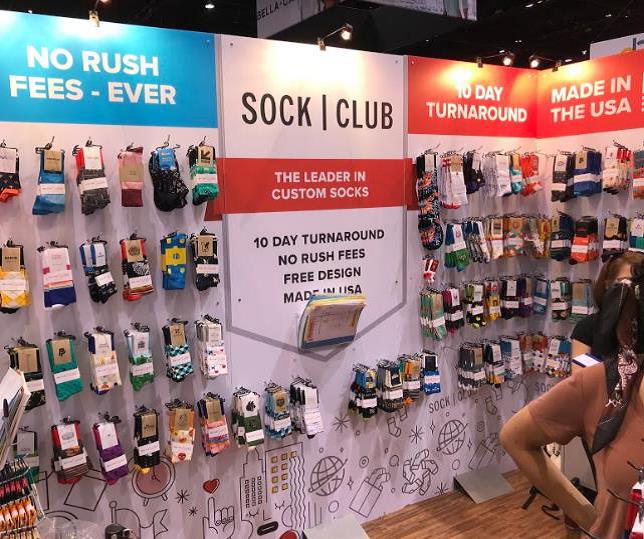
Sock Club Enterprises used short, simple phrases in its graphics to quickly convey how attendees could make money with its products.
Does size really matter? A small booth doesn’t mean small impact. Even a 10-by-10 booth can tell a story.
Make your small booth standout by using the full length of your wall, Ayres says. “Don’t be afraid to go tall and go big,” she explains. “Our infographic at the top seemed too big when we designed it, but it was the perfect size when we got there.”
Keep your infographics short and sweet. Use simple phrases to communicate information to attendees quickly and easily. “If you have to explain it in more than five words, then you need to think of another way to say it,” Ayres says.
Graphic placement is also important. Position your key message above sightline. “When you have a bunch of people in your booth, you want the most important information – what sets you apart – to still be visible,” Ayres says.
