Strategy February 04, 2026
Q&A: Jeremy Picker Discusses the Challenges (and Rewards) of Translating Logos Into Embroidery
The CEO and creative director of Colorado-based distributor AMB3R Creative worked on a project to create a mini-merch collection for Branding Together, the monthly podcast jointly hosted by ASI and PRINTING United Alliance editors.
Key Takeaways
• Jeremy Picker of AMB3R Creative (asi/590243) collaborated with Rockland Embroidery (asi/83089) to create a mini-collection of embroidered merch for the Branding Together podcast.
• In this Q&A, Picker advises distributors to evaluate whether a logo was designed to translate beyond print by reviewing line thickness, text size and detail to ensure it can be successfully embroidered.
• Push beyond standard flat embroidery by experimenting with stitch types, thread thickness and placement, and clearly communicate design intent with decorators through detailed mock-ups and examples.
Jeremy Picker, CEO and creative director of Colorado-based AMB3R Creative (asi/590243), is always on the lookout for fresh designs that push the envelope and challenge conventional notions of what logoed apparel is supposed to look like. Picker and his team brought their unique perspective to the Branding Together podcast merch project, reimagining the logo through various embroidery techniques. Andy Shuman and the team at Rockland Embroidery (asi/83089) in Topton, PA, then turned AMB3R’s vision into reality.
In this Q&A, Picker shares some of his insights for turning a logo into embroidery and getting creative with stitch types and design placement.
Q: What are some considerations when transforming a logo into embroidery?
A: First, we look at the detail of the logo. Was it created only for print, or was it designed properly to work across multiple media? We analyze the line thickness and size of the text to determine what can realistically be achieved with machine embroidery.
We always go through a sampling process at different sizes to see how the logo will translate. It’s the best way to identify potential issues early on. We like using Graphix Source for digitizing because they provide physical sewouts with every file. That hands-on proof makes it easier and faster to refine the design.

For this year’s fashion shoot in the winter issue of Counselor, we asked decorators to create a cohesive mini-collection of branded merch, using garments and accessories supplied by Stanley/Stella (asi/89011) and Atlantis Headwear (asi/37380). Decorators also documented their design and production process in tutorials and reflected on the process in short video interviews.
Check out all the stories on ASI Central and Apparelist:
- Branding Together January episode
- Branding Together January mini-episode
- Build a Brand
- Dye Sublimation Tutorial from Angie Meese of That Shirt Shack
- DTG Tutorial from Deana Iribe of The Print Bakery and DTG Connection
- Screen-Printing Tutorial from Lon Winters of Graphic Elephants
- DTF Tutorial From BeeGraphix
- Heat-Transfer Tutorial From TopShelf Printers
Q: What are some problem areas to keep in mind during the design phase?
A: Make sure the counters (the open spaces inside letters like A, O and P) don’t close up so the text stays legible. Ensure line thicknesses meet the minimum required for embroidery. (Tiny, thin lettering doesn’t work well in thread.) Always account for pulling and stretching on the fabric, especially on knits or stretch materials.
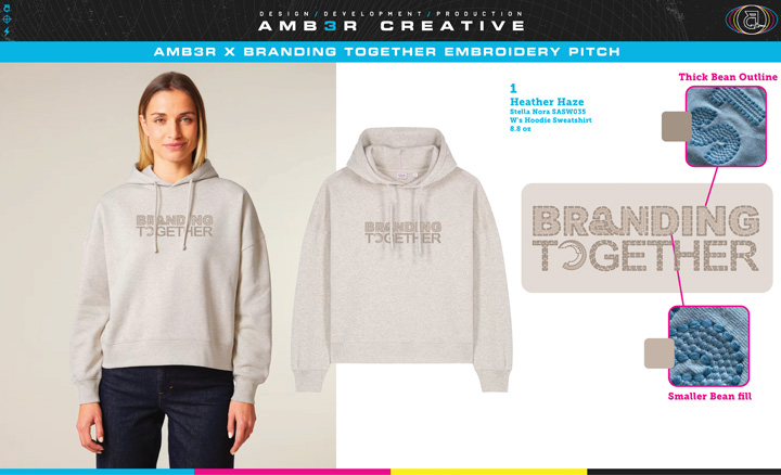
AMB3R Creative (asi/590243) created this design as part of the Branding Together merch project.
Q: Can you talk a little about how you came up with the designs for the Branding Together project?
A: Since we like to go beyond standard flat embroidery, we wanted to integrate unique stitch styles and placements while keeping the main structure of the logos intact. We experimented with faux chain stitch, thick bean stitches and more abstract textures inspired by printed graphics. The idea was to make each piece feel unique, but still cohesive across the collection. One of my favorite approaches is using stitch thickness as a layering effect to add depth and create that “must-touch” feeling.
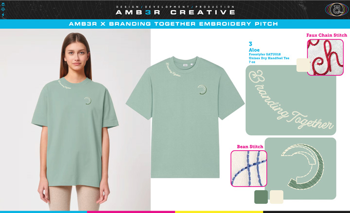
AMB3R Creative created this design as part of the Branding Together merch project.
Q: The cursive script detail around the neckline of the T-shirts really stood out in the collection. Where did you draw inspiration for that particular design?
A: For that one, I wanted a luxurious yet feminine design that was easy to wear without heavy stitches, but still had a fun twist. I remembered a trend report I did a while back highlighting creative embroidery placements, and following the neckline stood out as the perfect opportunity. It’s flattering, unexpected and creates a great focal point.
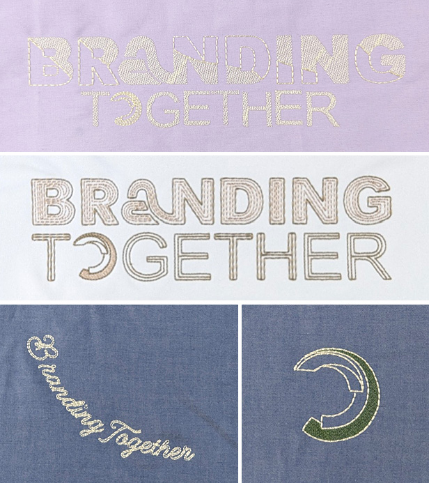
Sewout swatches like these, created in advance of production by contract decorator Rockland Embroidery (asi/83089), help distributors avoid potential design problems.
Q: What are some tips for communicating your vision with your contract decorator?
A: Start with detailed mock-ups and visual examples of what you’re trying to achieve. Not everything translates perfectly to the final garment, so working through those details before production allows for adjustments.
Every embroidery shop is different. Machines, hoops, needles, thread types and timing can all affect the outcome. It can be frustrating to adapt, but overcommunication is key. The more context you provide, the closer you’ll get to your design vision.
Q: Any other tips you can share?
A: Go beyond the basics. Use my Embroidery Inspiration board on Pinterest to spark ideas for your next project. Experiment with unique stitch types, different thread textures or fabric appliqués to replace or enhance stitch areas. You can even use embroidery as an accent to screen-printed designs. At the end of the day, clothing is meant to be worn, so have fun with it, push creativity and give people something cool to wear.