Strategy July 10, 2018
Tips for All-Over Designs
Logo mania is on trend in the fashion world, but covering apparel in logos isn't the only way to approach all-over prints.
In a Nutshell
*Fashion designers are reviving the ’90s trend of covering their wares with all-over logo patterns.
*More subtle all-over designs also can have a strong visual impact.
Remember the logo mania of the ’90s, when toting a purse proclaiming its designer label loud and clear was the height of fashion? And a logo-patterned suit was considered chic? Just like almost every other trend from that era, the all-over logo print is back with a vengeance.
Of course, not every logo is an ideal candidate for the in-your-face treatment currently favored by fashion houses. We spoke with Tim Lunt of Stain Imaging in Salt Lake City, UT, about some different approaches to all-over prints that have a more universal appeal. Stain Imaging, which itself has been around since the 1990s, is a proprietary all-over decorating technique that’s semi-translucent and leaves a soft hand.
Here are three design methods to consider when creating an all-over print:
1. Create a texture.

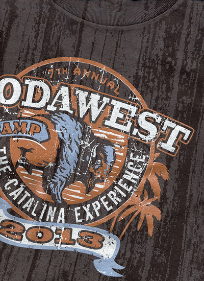
You can transform an ordinary blank tee into a custom product by adding an all-over pattern – a wood-grain texture, a marbled look or even a subtle tone-on-tone tie-dye effect. “Almost any pattern or texture can be executed with Stain Imaging,” Lunt says.
2. Create a visual theme, rather than just a step and repeat.

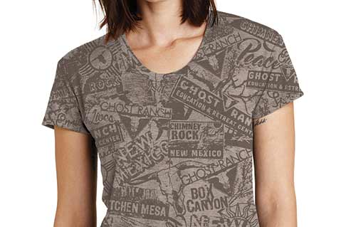
“You can use secondary and tertiary elements as filler, so it’s not 20 of the same logo on a shirt,” Lunt says. He gives the example of a microbrewery that has six or seven distinct labels in its lineup. The company didn’t want any of the beer labels to overlap or touch on its all-over print, so to fill the spaces in between, Stain Imaging created a brew-related motif, consisting of images of wheat, barley and hops. “It evokes the concept and creates visual interest, plus serves the requirement of filling everything up,” Lunt adds.
3. Create a background design that supplements your main artwork.

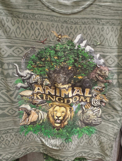
This is an approach Stain Imaging used when it worked with Disney. “The obvious thing is just to put Mickey Mouse all over a shirt, which we did initially,” Lunt says. For its Animal Kingdom merch, though, the brand wanted something more unique, so Stain Imaging developed a pattern based on African tattoo art and pottery designs to complement the 10-color screen print that would dominate the T-shirts. “We didn’t want the background to be too overbearing, but to more subtly speak to the concept of what was going on,” Lunt says.
