Commentary November 05, 2024
NASA Is Deftly Using Branded Merch To Build Buzz Around Its Artemis Program
The chicly designed apparel and accessories are helping stoke public interest in forthcoming crewed missions to Mars and the moon.
Key Points:
• Artemis II Launch & Branding: NASA is preparing for the Artemis II crewed launch in 2025. To build excitement, the agency has launched a line of branded merchandise reminiscent of limited-edition streetwear drops.
• Educational & Eye-Catching Campaigns: NASA’s branding efforts, developed with Design Bridge and Partners, aim to be both eye-catching and educational. The Artemis logo and merchandise are designed to capture the imagination and highlight the mission’s significance.
• Promo Perspective: A lesson the collection can teach merch distributors is that you need to take each element of a client’s brand and story into consideration as you develop solutions.
While the 10-day flight, including lunar flyby, isn’t expected to occur until September 2025 at the earliest, NASA is already building the Artemis brand and getting everyone on the ground pumped about the return of lunar exploration.
And, notably, a line of merchandise is a key component of that excitement building.

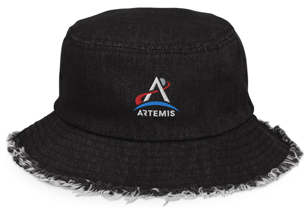
This distressed bucket hat is one of the trendy streetwear-influenced products on the site’s shop.
NASA is an interesting case when it comes to branded merchandise. Its logo – sometimes referred to as the worm and the meatball – are public domain, meaning anyone can make NASA T-shirts or other promotional products to capitalize on excitement around launches. Even its proprietary programs, like Artemis or the Europa Clipper mission, are in the public domain.
Even so, NASA has launched (corny pun intended) its own line of branded gear to spread awareness of its new program, and the collection is reminiscent of the “streetwear drops” you’d see from other businesses right now, like restaurants or sports teams. The NASA line is a relatively small batch of products with modern design elements. The scarcity is on purpose. It’s supposed to look like a limited-edition release that could sell out at a moment’s notice.
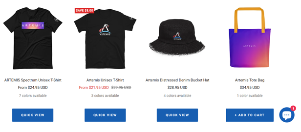
The product selection itself is also apparel- and accessory-forward. There are T-shirts, tote bags, bucket hats, trucker hats, keychains and notebooks, and they all use either a black garment to represent the vastness of space or the blue-to-red color scheme that looks like the sun rising over the earth.

A collection of Artemis products in the NASA shop using the black and gradient design elements.
Much like the planning process of a mission around the moon, the Artemis branding effort was apparently years in the making. Fast Company reported that the design team at NASA, along with studio Superunion (which later merged with Design Bridge to form Design Bridge and Partners), started working on it in 2020.
Design Bridge and Partners Senior Strategist Lily Thaler told Fast Company that the folks at NASA wanted “a broad array of deliverables,” ranging from helping to define the missions for external audiences to creating the visual assets that would bring them to life.
In short, NASA required solutions that were eye-catching and educational.
“They needed a full-service brand to tell the Artemis story,” Thaler told Fast Company.
We’re in an interesting era for space exploration right now, where NASA not only has to educate the public on its programs but also compete with other space exploration businesses like SpaceX for attention.
Remember, SpaceX was founded by Elon Musk, who is no stranger to a promotional campaign. For sure, there’s no shortage of SpaceX memorabilia on the site’s store, like apparel, signage, patches, toys, stickers and even a torch that looks like a rocket.
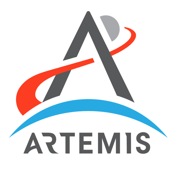
In order to stand out in this space (sorry, pun again…), NASA wanted a logo that really captured the imagination and served as a visual representation of the scope and importance of the mission.
Per Fast Company:
The letter A represents an arrow from the project namesake’s quiver, and the blue Earth stands in for a bow; the A ultimately points past the moon to highlight the project’s role in space beyond it; the trajectory pattern that makes the crossbar of the A is red for Mars.

“Being a flagship mission elevated the brand and design support needed to accomplish our communication goals,” NASA Merchandise and Branding Clearance Manager Aimee Crane told Fast Company. “Artemis is a high-visibility and internationally integrated mission, which required greater attention to detail and broader design thinking strategies applied to the overall design system.”
With that, it’s safe to assume that NASA will continue to push the Artemis brand in the months and years leading up to subsequent launches, especially as it gets closer to its ultimate goal of a crewed mission to Mars.
When you think of scientific space exploration and crossing that ultimate finish line of putting a human on Mars, which has been a lofty and distant objective since the dawn of space travel, you might not think of items like T-shirts or stickers playing a role.
But, as NASA and SpaceX have shown us, educating and exciting the public is crucial, especially for something like NASA, which operates as a government entity.
A lesson for distributors and product designers here is that, even if your client isn’t trying to send people to the stars or change the way we as humans understand our universe, you need to take each element of the brand and its story into consideration. Just as the gradient design of the Artemis branding is meant to evoke the sunrise in space as well as a sunset on Earth, consider how colors can evoke emotion in the end-user.
Also, evaluate how a line of complementary products like apparel, headwear and hard goods can create a wide-ranging brand experience. You don’t have to go the Elon Musk route of playing with literal fire through torches or flamethrowers, but a bit of added creativity and design motifs that touch on what your client does can add flare and novelty that leaves a lasting impression.
Of course, please be careful if fire is involved. That’s a lasting impression that end-users might not want, and could end up in a costly recall.

